Technique Used - for Designers and Scrappers: Selection, Gradient Fill, Wave and Blending
By Papierstudio Silke
 Gradient Overlay
1. - Open any paper 3600x3600- 300 dpi
2. - create a new layer
3. - set foreground color to a light gray like this here #e9ebee
4. - set the background color to a dark gray like here: #949494
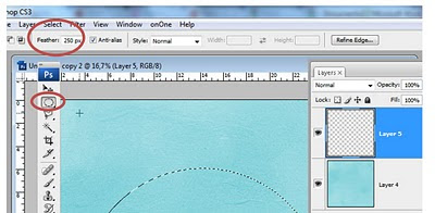
5. - pick the round selection tool and set the feather to 250
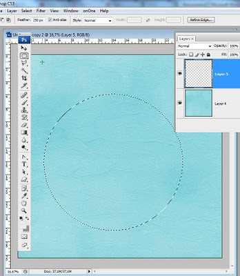
6. - create a big circle in the new layer with the selection tool
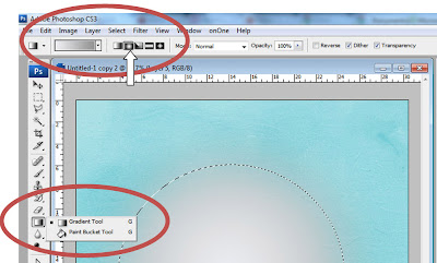
 7. - set the fill tool to gradient and choose the round option
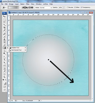
8. - fill the selection with the gradient (center your mouse and drag diagonally to the lower edge)
 9. - Deselect
Distort
I find that this is too regular for a lightning gradient overlay, so let's make it a little bit irregular:
10. - go to filter > wave this gradient in order to distort a little bit this round area.
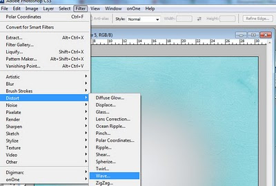 Filter > Distort > Wave (click the image below to enlarge)
Type - Sine is marked.
Number of generations: 1
Wavelenght: 556 - 561
Amplitude 94 - 318
Scale 100%
- Repeat Edge Pixels is marked
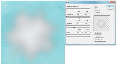 Enlarge this layer:
11. Now set this layer to a bigger size: 140% - select the layer, hit ctrl + T and set Width and High to 140% (or something like this - play with this setting)
Layer Blending:
12. set this layer to OVERLAY and change the opacity slider to about 63%
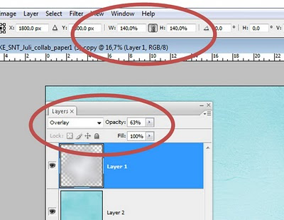
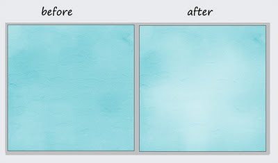
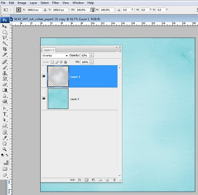 Ready ! see here below the before and after:
 Thank you for visiting my blog and please, remember, I love comments!!
Happy Scrapping
Silke

3 comentários:
Thank you! This will be very helpful!! :) AND a lot faster than trying to figure it out myself! LOL
PS LOve, just adore, your blog background -- so pretty!!
Awesome tutorial Silke, as always! Thank you!!
Cool beans! Great Tutorial, Silke!
Postar um comentário