For beginners, it is not easy to create a harmonic color palette. A digital scrapbooking kit with a tonal harmony catches the customers eyes immediately!
So I’m going to give you some useful tips. This is not a color theory lesson, these you can find all over the web and I recommend you to do so.
To find a color palette for you first kit, I recommend that you pick up 5 colors. I will show you how to find a tonal harmony. At the end we will have a result with 8 or 10 colors.
First Step: Pick a picture from a magazine or a beautiful image that inspires you.
I used an image that I found at Flickr for my example:
Next step: at www.kuler.com you can pick the five colors from that image.
Kuler is a great tool, you have to sign in or register in order to use the site. You can move the little dots inside of the picture and pick any color you want! Go ahead and play with colors!
Next step:
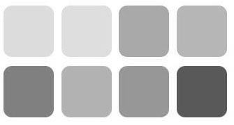
How to create a TONAL color swatch. You will need a grayscale image with a range of tonal values. (save my image below to your hard drive).
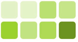
Pick the first color (green), open it in photoshop. Also save my tonal grayscale image here and apply the green color to become a variety of green tonal options.
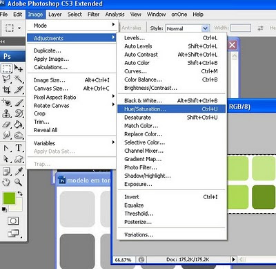
Open the grayscale image, set foreground color to the first color (green) and in the menu choose: image> adjustments>hue and saturation
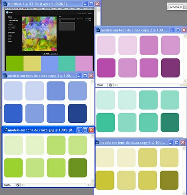
Now repeat this step to the other 4 colors. The result will look like here:


Now repeat this step to the other 4 colors. The result will look like here:
The next step has an very important theory: a good contrast or a good tonal variety is important. The two extreme tones or values are very dark and very light. Successful swatches for digital scrapbooking kits have tonal contrast in them, or a range of values.
From my 5 color swatches above I ended up with 8 colors, see below:
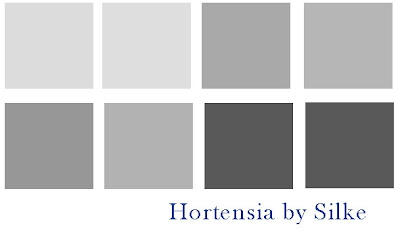
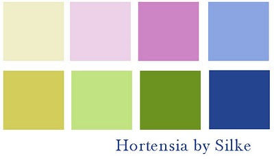 Dessaturate your colors to see if your tonal values have a variety of value ranges! This here looks very good!
 If you want to deepen more about tonal colors, go here. Painting Color Class: Tones or Values
By Marion Boddy-Evans, About.com Guide
New Product - click on my stores to get it
If you like it, you can grab a freebie cluster made with the kit:
I love comments!
TFL! and hugs!
Silke



4 comentários:
Thank you so much for this Freebie. I want to let you know that I posted a link to your blog in CBH Digital Scrapbooking Freebies, under the Page 6 post on Jan. 17, 2010. Thanks again.
Thanks so much for sharing this great freebie! I posted it on my blog Hand Picked Freebies! :)
wow Silke! Thank you so much for sharing those tipps on creating a color-scheme, for it is soo difficult in the beginning to find colors that match in the eye of the user in the end - but harmonic is the best way to have an eyecatcher!
PODEROSA ! Te Adoro viu? E muito obrigada pelas suas dicas MARAVILHOSAS.
Bjs, Dri Mendes
Postar um comentário